What Makes Knockout Different
There are a number of different Webflow frameworks available, varying on the basis of personal taste, use and quality, just as there are plenty of ingredients on the coffee aisle of your local market. Some are better than others. But the difference between two given frameworks might also be entirely subjective.
Knockout includes many of the same features as other frameworks (classes, a basic style guide, a few components, etc.), but we didn't create Knockout just to add one more framework to the pile. We created it to solve a number of specific issues we ran into over seven years of working in Webflow as an agency. And the resulting toolset ended up defining our approach to all projects, from boutique single-page marketing sites to large-scale, long-term enterprise engagements. There's a number of different ways to brew a cup of coffee, and different folks might have their own favorite way. But this is the way that works for us. And we think it will work for you, too.
Here's a few things that we do differently than everybody else.
1. Conversational, self-evident class naming
We like capitalization and spaces, and we like long lists of clearly named utility classes. Ok, we don't like them. But we think recreating a string of classes to make a change is far better for the long-term manageability of a project than having to reverse engineer a bunch of custom classes. It's cleaner, it's better for teamwork, and it allows clients to quickly and easily understand how their project was built. Besides, haven't you ever heard the story of the Tortoise and the Hare?
Read more in Class Naming
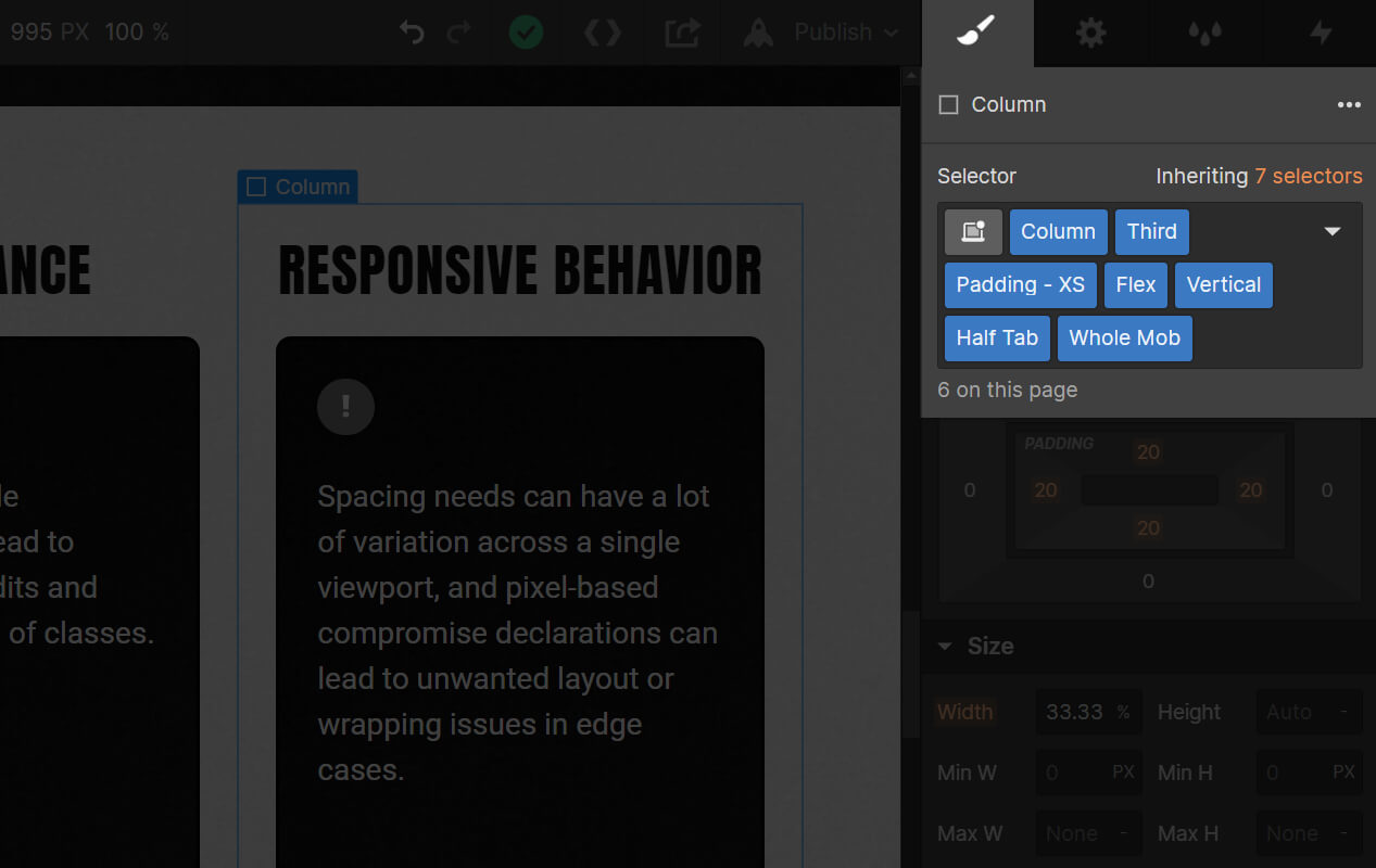
2. The 14-column responsive grid
This is a little bit of a misnomer. We use a standard 12-column grid for content (as to be evenly divisible by 2, 3 or 4), but we typically use the two outer columns as responsive gutters. We've found this to be the best approach for us since Webflow doesn't support the CSS calc function (which would allow us to mix pixel and VW units). Using the 14-column responsive grid, we can create fluidly responsive padding and spacing utility classes that can be used modularly across the project (which wouldn't be possible with percentage units), which creates a ton of time-saving and space-saving efficiencies.
Read more in Grids, Spacing and Units
3. Intelligent viewport optimization
A lot of optimizations are built into the Knockout classes, specifically across large and small viewports. For instance, we intentionally gave our padding suite non-specific names like <class>Padding - XXL<class> because the definition is going to change across different viewports. A more specific convention like <class>Padding - 128px<class> would demand a certain rigidity. But we would rather pre-optimize the padding for mobile so as to reduce busy work.
We've also pre-defined all text and spacing classes to scale up proportionally starting at 1440px, and then convert to pixels and max out at 1920px, eliminating a lot of the busy work of viewport optimization.
This means that while you're building your project at the Desktop viewport, a lot of the optimization for other viewports is being done in the background.
Read more in Breakpoints and Viewport Optimization
4. Adaptivity
Our utility classes are specifically designed to be adaptive to the needs of a given project. Our padding and text systems, for instance, are named using an XXL-XXS system so that they can be adjusted according to a project's needs. And if a project requires a full-width 12-column grid, with some effort, the values for padding, margins and columns can be updated with math that's divisible by 12, rather than 14.
Read more in Setting Up Knockout & Advanced Grids