Grid, spacing, and units
Columns
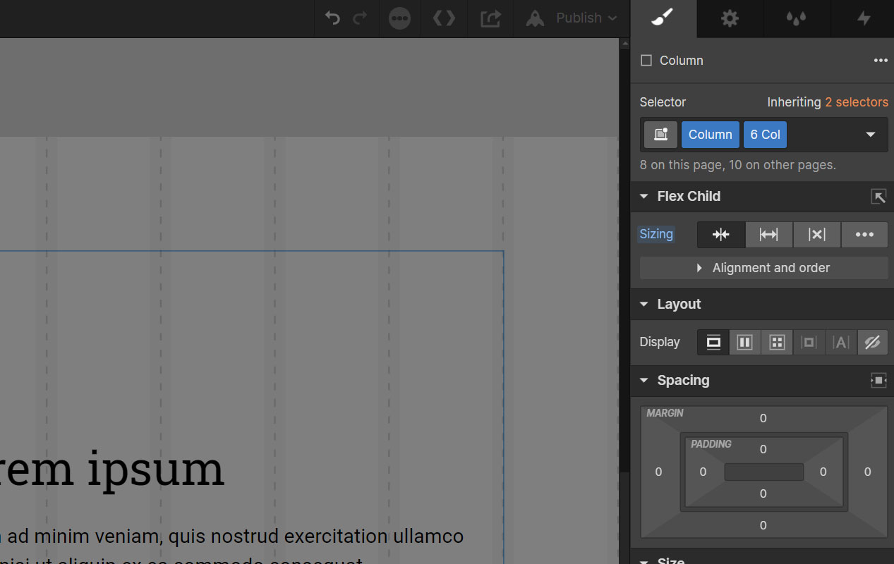
Columns can be used as free-standing layout elements or nested inside a div with the <class>Column Wrapper<class> class to display side-by-side. For instance, you might combine <class>Column<class> <class>6 Col<class> <class>Center Element<class> to get a 6-column, centered content block. Or nest <class>Column<class> <class>4 Col<class> and <class>Column<class> <class>Auto Col<class> inside a <class>Column Wrapper<class> div in order to achieve a side-by-side layout.
Viewport-Based Columns
Viewport-based columns are great for when you need to land precisely on grid. For instance, a 4-column sidebar or a centered 8-column content block. The handy aspect of VW units is that, unlike percentage units, they maintain their size regardless of the size of their container.
A rule of thumb to is to use VW units when the width of the columns (relative to the grid) is paramount and percentage-based columns when the number of columns is paramount.
There are two reasons to avoid 100VW measurements or combing columns that add up to 100VW. One is that different browsers account for scrollbars in different ways, so you always want to leave 20px of wiggle room for those situations. The other is that rounding errors sometimes compute a column to be 1 pixel too short or too long. To solve for these cases, it's best practice to define one column as Column Auto Col, which will simply stretch to fill in the remaining space. So instead of using Column 8 Col and Column 6 Col, you would use Column 8 Col and Column Auto Col.
Percentage-Based Columns
Percentage-based columns are best for when you need to repeat a specific block of content over and over. For instance, a layout of 3 repeated cards. Percentages will give you the flexibility to divide the space evenly even if the parent div is not exactly 12 columns because percentage units adjust to the size of their parent div.
Adjusting Columns Across Viewports
The column suite has a set of classes for each viewport, so adjustments can be made on the fly by stacking classes. For instance, you might use <class>Column<class> <class>6 Col<class> <class>8 Col Tab<class> <class>10 Col Mob<class> for a div that gets wider on smaller screens. Or you might have two columns with the classes <class>Column<class> <class>Half<class> <class>Whole Mob<class> which will align side-by-side on desktop, but stack on mobile.
Margin Offsets
It's important that repeated elements have balanced padding in order to be interchangeable with one another and across viewports. For instance, a set of Testimonial Cards might be 3up at desktop, 2up at tablet, & 1up at mobile. So you don't want to be juggling a lot of side-specific paddings for different viewports. You want all-sides padding so that the Cards can stack any way they need to without needing padding adjustments. The problem is that all-sides padding is going to bump the outer edges off grid.

CSS Grid addressed this by moving the padding to the parent div. But using negative margins, we can accomplish interchangeable, sequential cards without straying from the grid. For example, if your inner columns use <class>Padding - S<class>, adding <class>Margin Offset - S<class> to the parent div (<class>Column Wrapper<class>) will apply the offsetting negative margin.
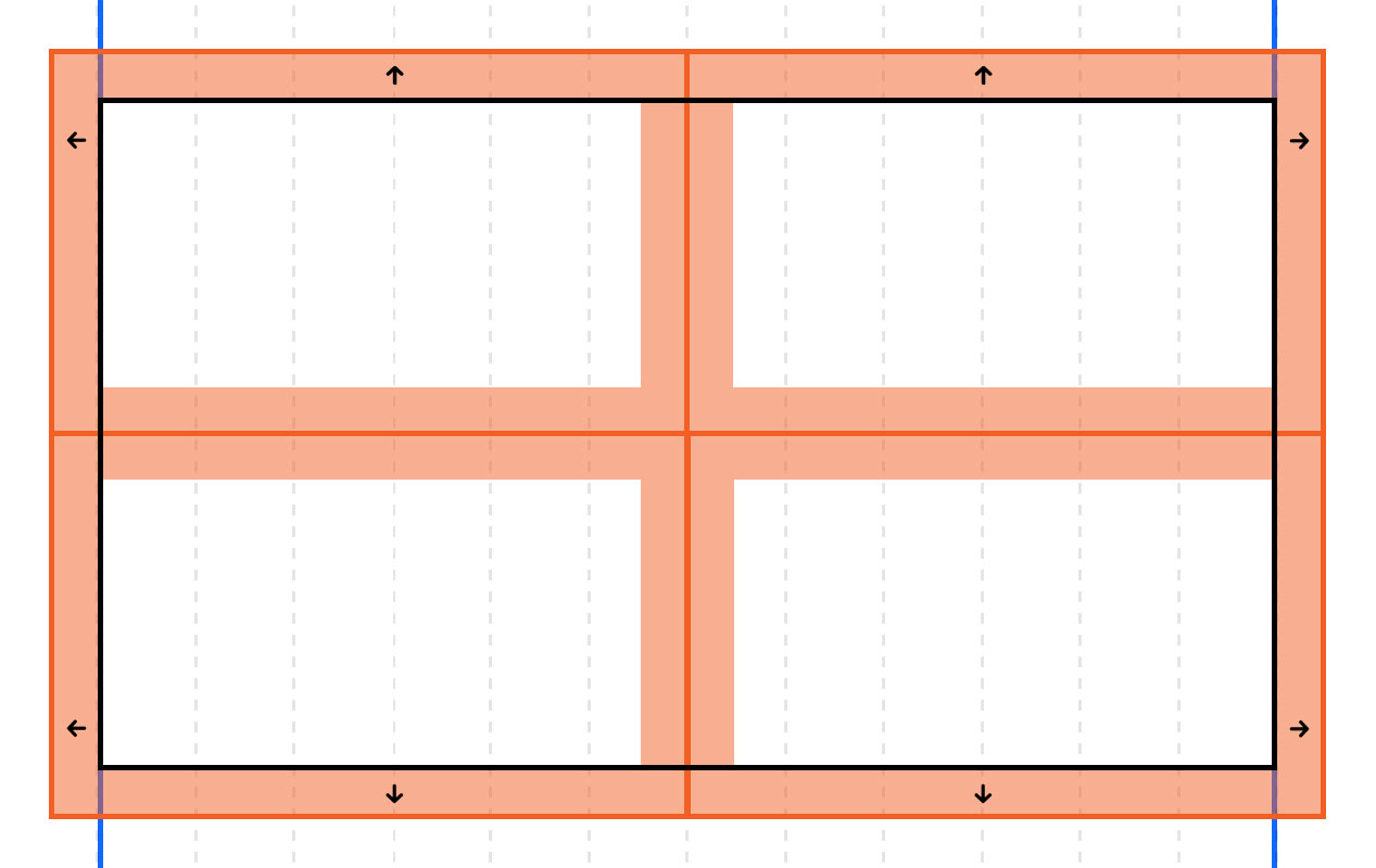
When a Margin Offset class is applied to the Column Wrapper div, it will need to be nested inside another div in order to achieve bottom margin because you can't apply two different margins to the same side of the same element.
The grid lines shown in the screenshot above are accessible at any time via Body (All Pages).
Padding and spacing
Knockout uses VW units for padding and spacing because they accommodate the content better across entire viewports, they adjust along with the grid, and are more predictable to use than percentage units. Using pixel or REM units, any padding or margins will be the same size whether the viewport is 992px wide or 1439px wide, forcing the content to wrap or shrink as the viewport shrinks. With VW units, the padding and margins grow or shrink along with the viewport, reducing the burden on the content to resize. Responsive padding and margins can also be accomplished with percentage units, but since the percentage is relative to the parent div, 25% of a full width div is going to be twice as much padding as 25% of a div that only spans half of the viewport. VW units gives us responsively behaving padding and margins that can be applied predictably to any element.

Pixel units are sometimes better suited for interior component spacing, when expanding or contracting spacing is unnecessary. Also, any measurements below a half-column will likely need to be defined in pixel units at smaller viewports in order to avoid shrinking too much.
Typography
For type sizing, Knockout uses pixel units in order to optimize for readability across entire viewports. Absent Webflow support for advanced CSS features like min/max/clamp, which allow for more granular control of scaling, using responsive units is likely to result in type that is optimized at the mid-point of a viewport but too large or too small at the extremes. So we use pixels for predictability.
At larger viewports however, VW units will allow linear upsizing, eliminating the creation of unwanted negative space. And pixel are easy to mathematically convert to VW units above 1440px.
For typography aspects that are relevant to the font size, we use relative units: percentage or EMs for line height and EMs for letter-spacing. This eliminates the need to recalculate pixel units if the font size changes at any point in the future, retaining the relative sizing.
There's a number of different ways to skin a potato, they say. And the same is true of many things in CSS. Which is why frameworks can be a little bit of a personal thing for developers. We think REM units are great for certain use cases, especially when scaling type proportionately across viewports. At Edgar Allan, we reserve the body font size for default styling of type & rely on zoom scaling in modern browsers to address accessibility needs. But if you prefer to use REM units, Knockout can be customized to support them by updating the CSS calculations in the Large Viewport Type embed within the Custom Code symbol.