Responsive Images
The object-fit CSS property solves a number of issues that were once present with standard Image elements. Essentially, it provides the flexibility of background-image with the ease of updating and SEO benefits of an image element by filling the parent container.
Using object-fit, you don't have to worry about a client uploading an image with the wrong aspect ratio. You have the flexibility to optimize the aspect ratio of the image across different viewports. And images can be easily updated in Webflow without having to create or edit a class, as you would with a background image. You can also provide alt tags for SEO and accessibility purposes.
The Parent Div
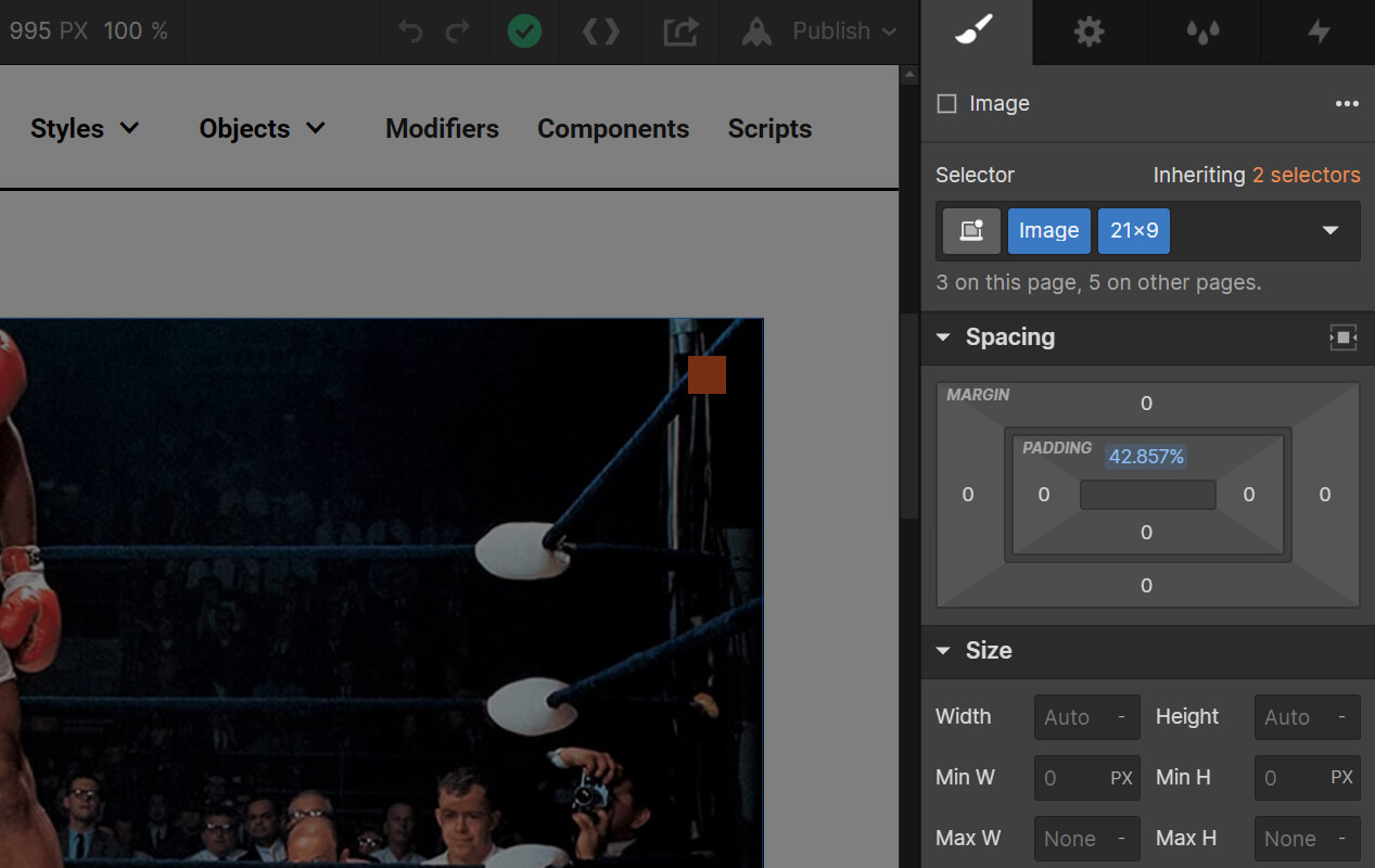
The parent div acts as a canvas for the image, describing the bounding box and desired aspect ratio. The <class>Image<class> sets overflow to hidden and position to relative, since the image will be positioned absolutely inside the div. And a subclass defines the aspect ratio of the image using top padding in percentage units.
The formula for this calculation is height divided by width times 100. So to achieve a 21x9 aspect ratio, it's 9/21*100, which equals a top padding of 42.857%. In other words, the height is 42.857% of the width of the image.
Knockout supports the following aspect ratios: 16x5, 21x9, 2x1, 16x9, 4x3, & 1x1.
The Image
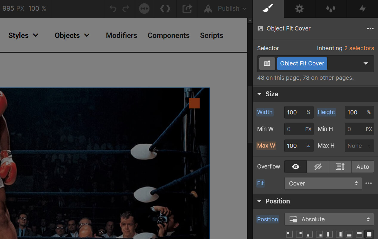
The image inside the div simply needs the <class>Object Fit Cover<class> class in order to fill the parent div as a background image would.
Responsiveness
One handy feature of object-fit is that we can adjust the aspect ratios across different viewports. For instance, we may want a very wide 21x9 image at desktop. But that could look small on tablet and downright tiny on mobile. So we can change the aspect ratio to 16x9 on tablet and 4x3 on mobile using the following string of classes: <class>Image<class> <class>21x9<class> <class>16x9 Tab<class> <class>4x3 Mob<class>.