Setting Up Knockout
Knockout can be extensively customized to suit the needs of any project. (See: Advanced Grids) But getting started is as easy as applying the brand's style (type styles, colors, buttons, etc.) to the style guide.
This guide will walk you through that application.
Applying Type Styles
Defining the type styles is the most involved part of the setup, but trust us when we say you'll be glad you did once you start building because the time you'd otherwise spend re-declaring type styles over the course of a project really ads up.
1. Body Type
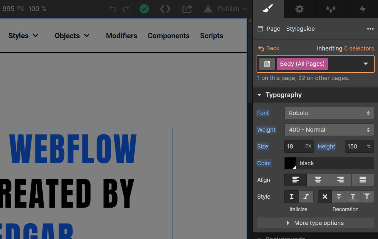
The vast majority of type on your site is going to be inherited from <class global>Body (All Pages)<class global>. It will be the default style for paragraphs, buttons, lists, and more, so this should be the default way you'd like text to display, with exceptions to these styles applied only as needed.
We like to use PX units for font sizes in order to optimize for readability across a given viewport, & we like to use percentages or EM units for line-height so that we don't have to recalculate if the font size changes. And we use EM units for letter spacing for the same reason.
Additionally, some fine tuning of type can be found in the <class>General CSS<class> HTML embed inside the Custom Code symbol. (This is particularly useful for enabling the font-feature-settings for specific fonts, but our default settings should generally work out of the box.)
2. Headlines
There's a Headlines Quick Setup area on the style guide homepage that will give you easy access to defining your headline styles.
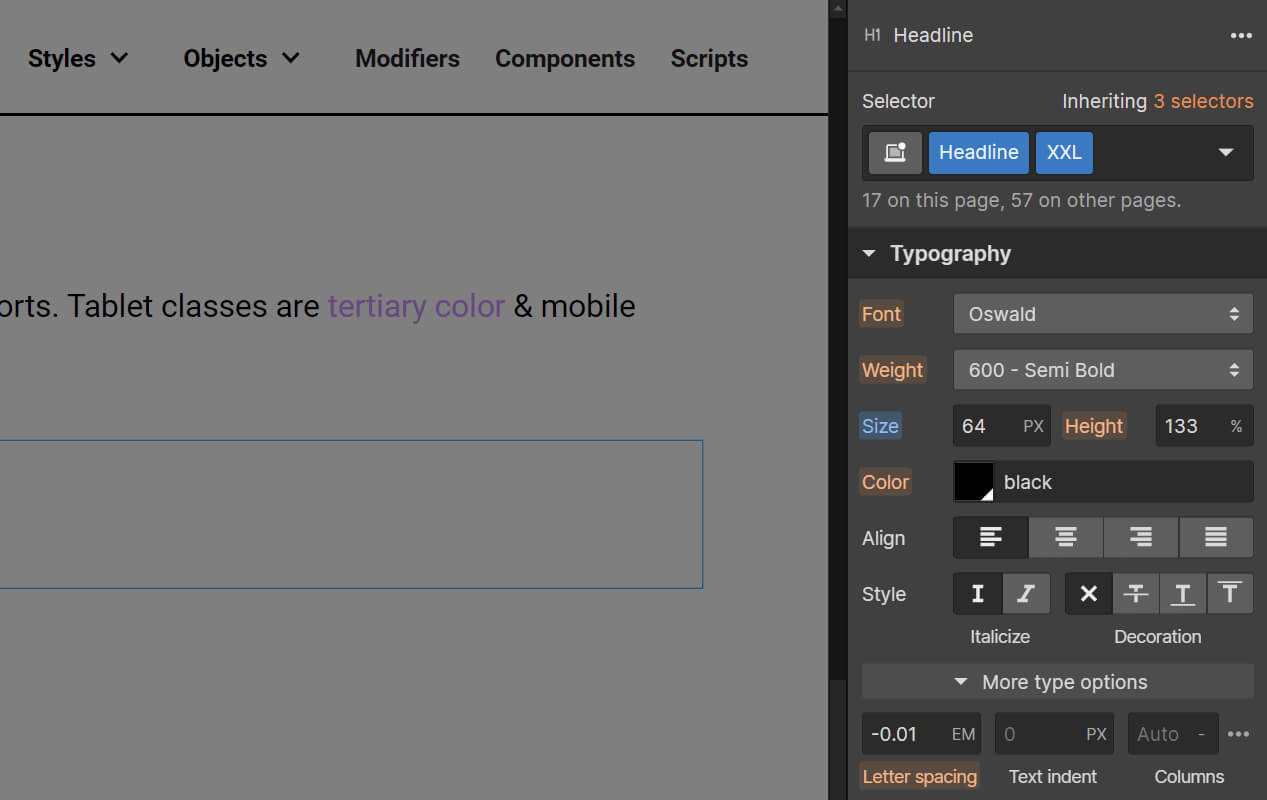
We think of headline styles (<class>XXL<class> through <class>XS<class>) as independent of the H1-H6 semantic elements, but not entirely. There may be times when <class>Headline<class> <class>XL<class> may need to be either an H2 or an H3 for SEO purposes, depending on where it falls in the page. So it's important that the classes override the default H2 or H3 styles. But for Rich Text elements, where individual classes can't be applied, we want the semantic elements and the styles to correspond.
So we tend to apply the font, weight, size, & line-height at the element level (<class global>H1 (All Pages)<class global>), then apply the weight, size, and line-height redundantly to it's corresponding headline combo class (<class>Headline<class> <class>XXL<class>).
Once we have the headlines set up how we'd like at desktop, we move on to applying any needed adjustments at the tablet and mobile viewports, applying the brand styles to the viewport classes (like <class>Headline<class> <class>XXL Tab<class>) & applying any necessary sizing adjustments across viewports to both the desktop classes & semantic elements.
Try not to apply colors to headlines in order to avoid breaking inheritance. For instance, if a site is generally black text over white, we can change the body text & headlines for a given section to white text over black by simply applying Background - Black and Text - White to the parent div without having to address each element individually.
3. Misc. Type Styles
There are a few classes on the Styles > Text page in the style guide that can be helpful to update, including alternate body type sizes (<class>Text L<class>, <class>Text M<class>, <class>Text S<class>), alternate fonts (<class>Serif<class>, <class>Sans<class>), and alternate line heights (<class>Line Height 100<class>, <class>Line Height 133<class>, etc.). And you should feel free to add to these classes if your project calls for it.
Webflow can be quite buggy when it comes to inheriting line heights, so the number in the Height box isn't always accurate. In most cases, the default value (when the title is orange) is relative to the Body (All Pages) font size. So for a class like Text S, which deviates from the Body (All Pages) font size, an orange titled 150% would be relative to the body font size, whereas as a blue titled 150% would be relative to the Text S size. So if you're changing a font-size with a new class, it's generally good to go ahead and declare the line height, even if it looks correct.
4. Large Viewport Type
Why manually optimize across viewports when you don't have to? Knockout is designed to scale above 1440 by converting PX units to VW, & then back to PX at 1920 to create a max-width. For type, this is done through a set of calc functions in the Large Viewport Type embed inside the Custom Code symbol.
Simply replace the variables with the desktop pixel sizes.
The calc function divides the desktop font size by 1440 to get a VW conversion for the 1440 viewport, & multiplies the desktop font size by 1.3333 for the max width conversion.
Feel free to add support for any other classes your project requires.
If you'd like to remove the 1920px max-width and have the design expand infinitely, the Finsweet Chrome Extension will allow you to remove the 1920 viewport styles. Just remember to also remove the 1920 calc functions from the Large Viewport Type embed element in the Custom Code symbol.
Colors
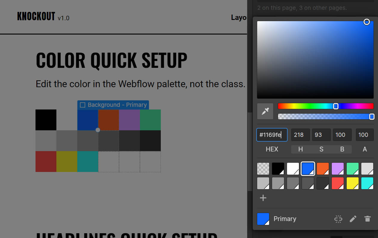
There's a Color Quick Setup area on the style guide homepage that will give you easy access to applying brand colors. It's important, however, to edit colors at the swatch level, rather than the class level because multiple classes share the same swatch (i.e. <class>Text - Primary<class>, <class>Background - Primary<class>, <class>Button<class> <class>Primary<class>).
If additional colors are needed, they can be appended to the end as Bonus color swatches.
Buttons
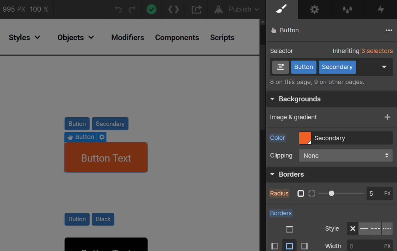
The buttons page allows you to apply the brand to numerous different button & CTA styles, each with varying degrees of inheritance baked in. For instance, adjusting the corner radius of <class>Button<class> will impact all other button styles.